


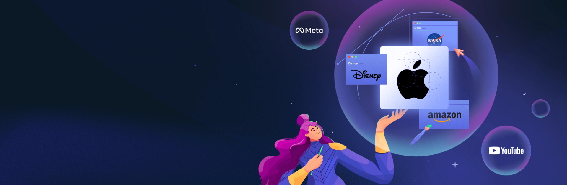
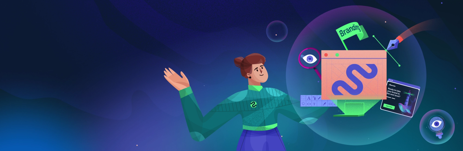
10 Types of Logos and When to Use Them


How do you design a logo? You start by choosing a logo type. Then, you do a delicate little dance, applying tried-and-tested rules while thinking outside of the box. The intricacies involved in logo design can be a lot to navigate, but you’ve landed on the right page. Read on to familiarize yourself with the various types of logos and when to use them for maximum impact.
Selecting the right type of logo is one of a business’s most crucial early brand decisions.
It’s like choosing what you’ll wear on that promising first date. Your logo type is the vibe you want to project: Sophisticated and stylish or quirky and creative? Your logo design is where you get specific: The cashmere cardigan or the washed-out hoodie?
First impressions count. This is equally true for brands. Your logo is part of that first impression and a powerful way to communicate your identity, values and approach. It can immediately set your brand apart from the competition and make it memorable and recognizable.
The choice of a logo type should be a strategic decision, blending contemporary trends with an understanding of industry expectations and the brand's distinctive character.

Trying to figure out where to start? Explore ten types of logos and the latest trends in this article and get inspired to create a standout brand identity.
What to Consider When Choosing a Logo Type
Answering a few key questions will help you narrow down your choice of logo style.
Determining the message you want to communicate is at the top of the list. You’ll also want to consider how and where the business will use the logo. Then, there are your competitors and industry to consider. How can you create a brand that stands out from the pack while still making it clear where it belongs?
To help answer these questions, consider these key points when choosing a type of logo:
- Personality, identity and values. Some logo types convey a sense of tradition and longevity; others lend themselves to playfulness or novelty. Whichever route you choose, the logo type should be consistent with the rest of the brand’s positioning.
- Versatility and scalability. Where and how will the organization use the logo? You want as much flexibility of use as possible, so you (or your client) don’t have to redesign the logo when needs change. A complex logo that looks good on a billboard could be illegible on a phone screen. Think about all possible scenarios.
- Industry. Brands in similar industries tend to opt for similar logo styles. But there are good reasons to go against the grain. For example, a youth-oriented finance startup might want a casual-looking logo to distinguish itself from more traditional competitors.
- Distinctiveness and memorability. Your logo should be unique. A good logo is one consumers will remember and recognize, and the right logo type will make this possible. Sometimes, there are good reasons to choose a type that’s common in your industry, but standing out from the crowd should be a top priority.
- Current trends. Whether you follow the latest trends or not, it's important to know which styles are popular, what’s on the rise, and what you’re conveying by choosing a trending versus a more classic logo type.
10 Types of Logos and When to Use Them
Let’s look at the different types of logos (or logo symbols) and how to use them effectively.
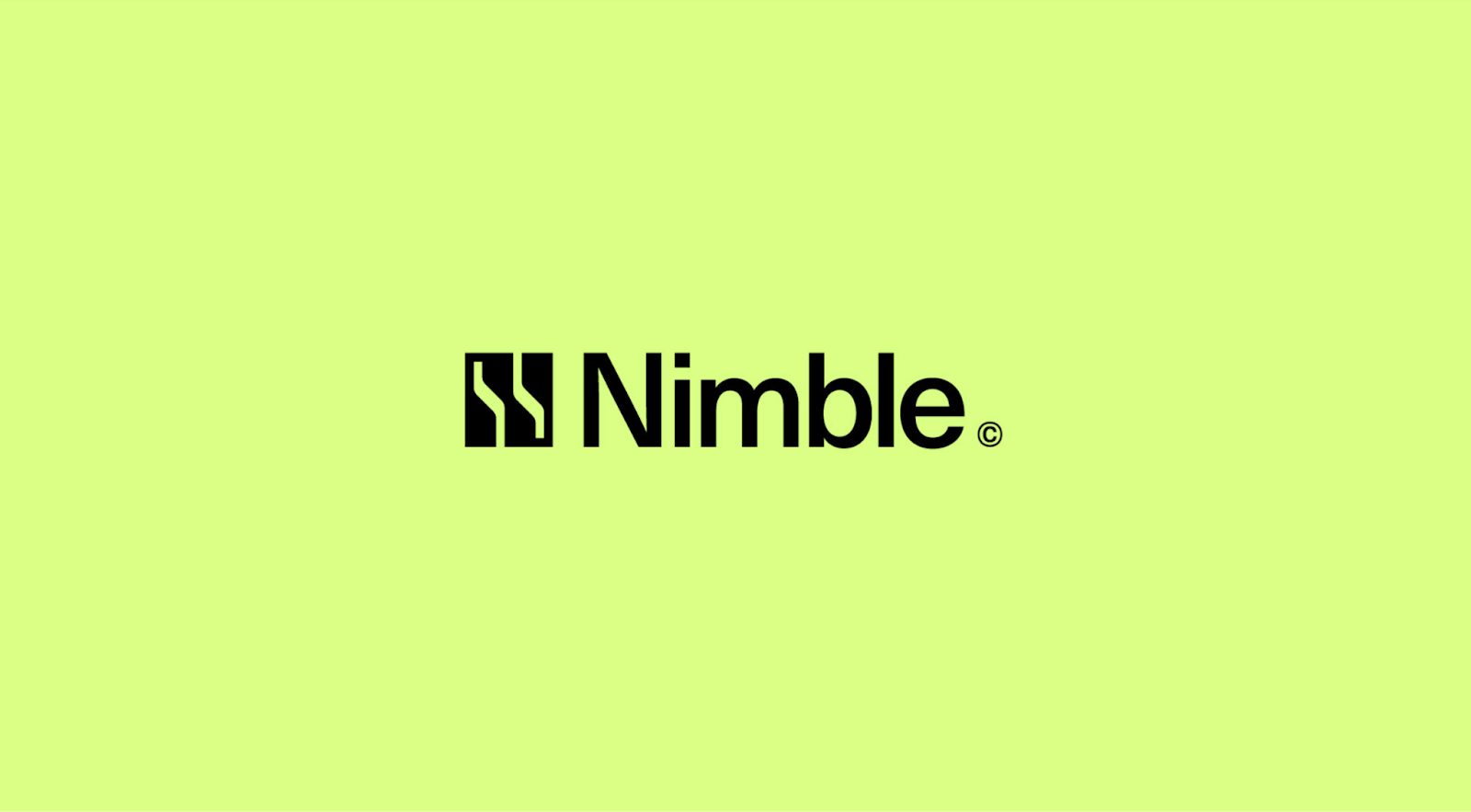
1. Wordmark


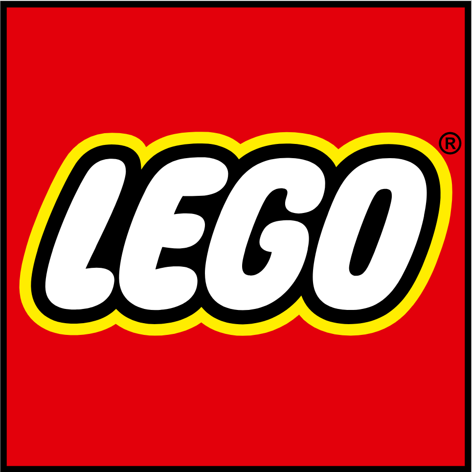

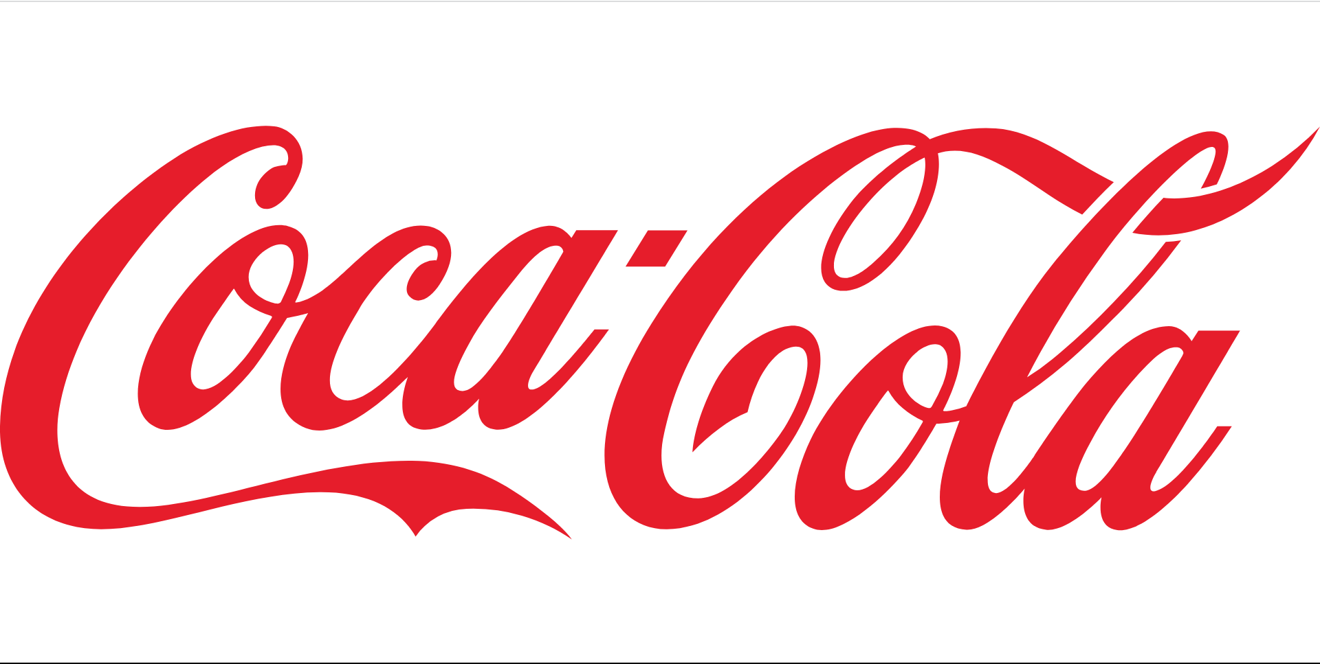
Wordmark logos (or logotypes) are based on a word (usually the brand’s name).
The wordmark logo is an excellent option for brands with short, catchy names, and can convey a wide range of brand personalities. Look at the difference between the Samsung and Barbie logos to see how flexible this logotype is.
Technology firms, creative agencies and service-oriented businesses often use wordmark logos. You’ll also find them in established organizations with high levels of name recognition.
Pro tip: The right typeface is critical for a wordmark logo. Choose or design a custom font that embodies your brand’s personality, and make sure it’s legible and unambiguous at all sizes. If your brand name is very long or complex, there are better choices for you than wordmark logos.
Examples: Google, Coca-Cola, Fender, LEGO, Canva
2. Lettermark

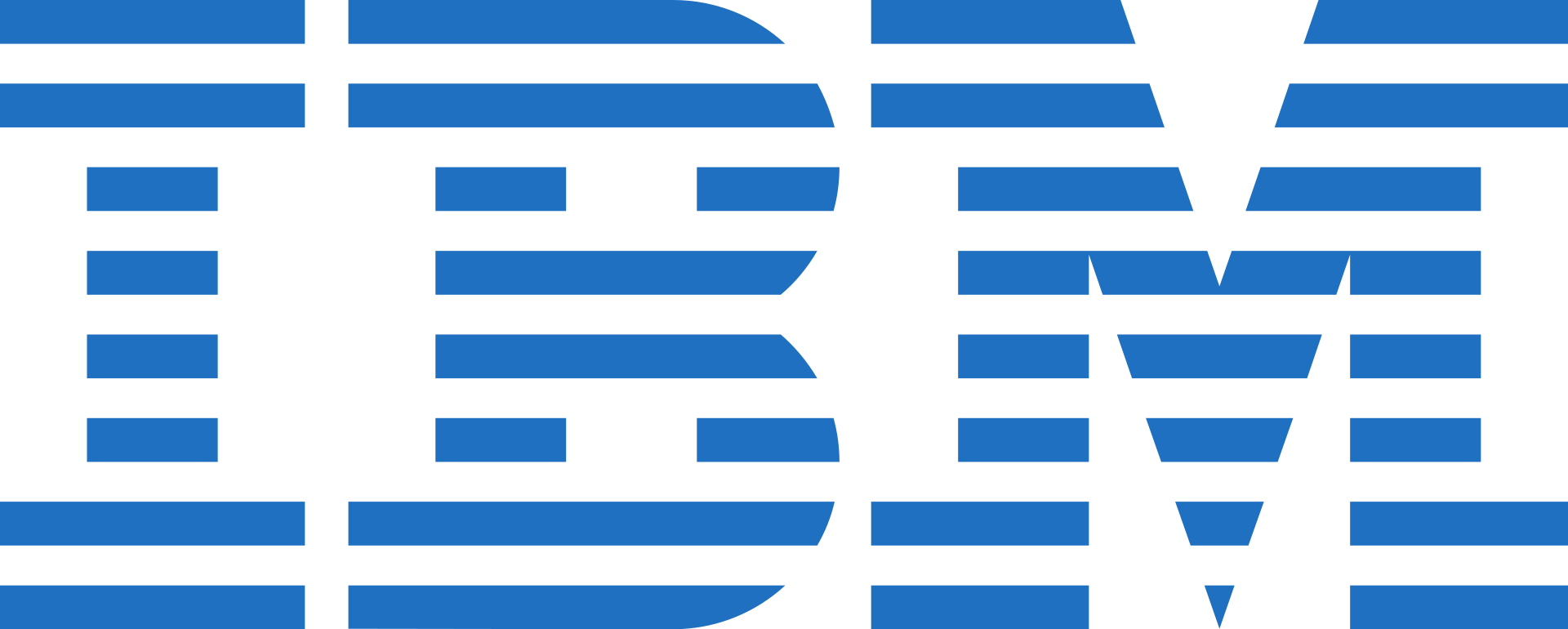

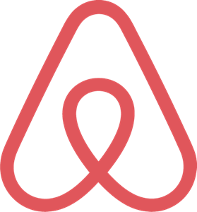

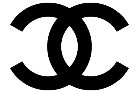
A lettermark logo consists of initials or letters. If there’s only one letter, you’re dealing with a letterform logo.
Lettermark logos (also called monogram logos) are a good option for brands with long or complex names. Lettermarks allow for balancing a strong visual identity with good name recognition. There’s also room for clever visual play. For example, the Airbnb logo transforms the letter “A” to also resemble a map pin icon and heart shape.
You’ll find the lettermark or monogram logo in various industries, but they’re often attached to luxury brands, fashion and large, established organizations.
Pro tip: Design a simple, readable lettermark that’s impactful at any scale. Legibility, minimalism and clarity are key when designing a lettermark logo. Think carefully about your spatial and visual design, whether you’re going for a single letterform or an intertwined monogram.
Examples: IBM, Chanel, Under Armour, Airbnb
3. Pictorial mark

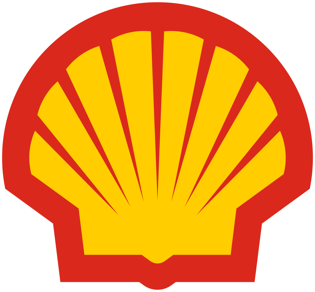

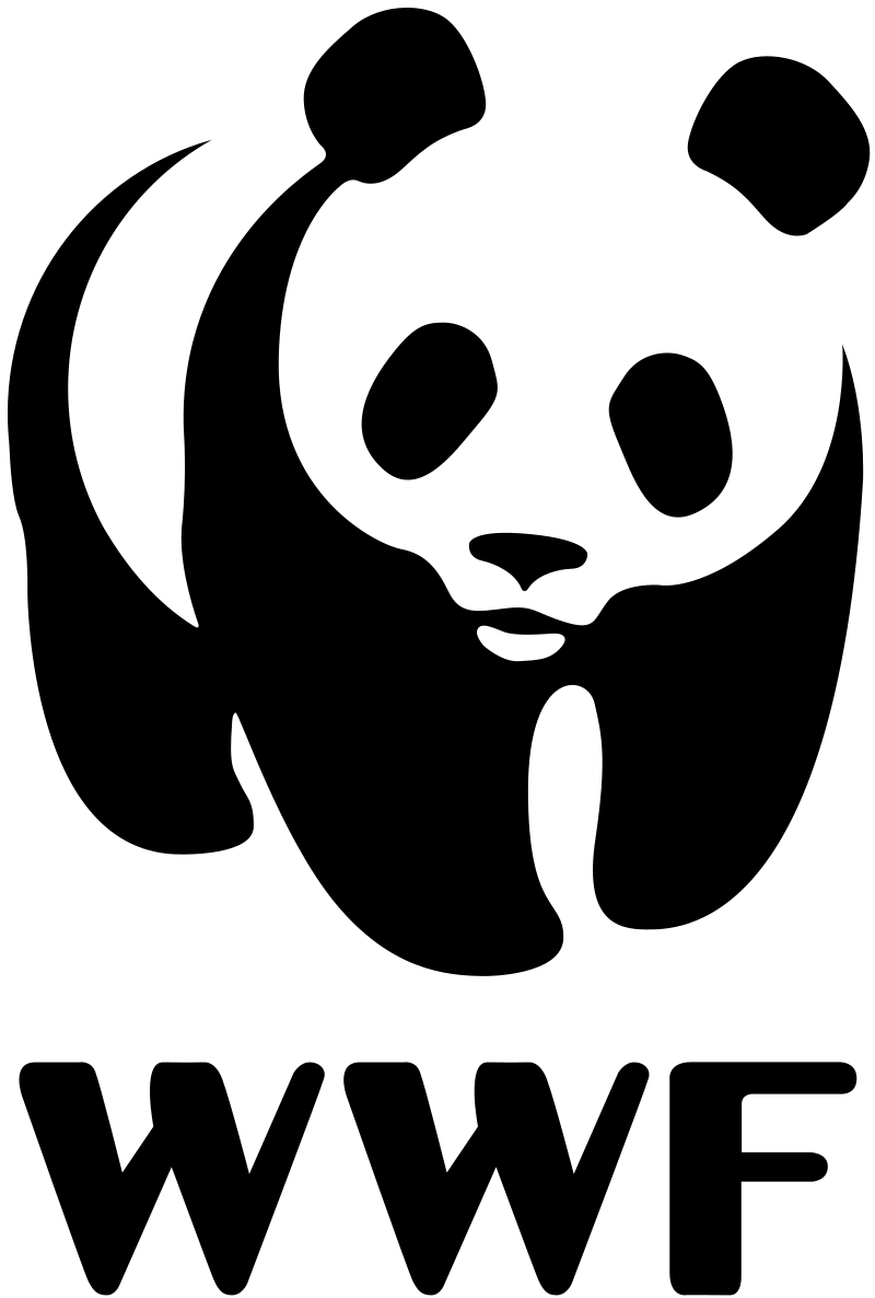
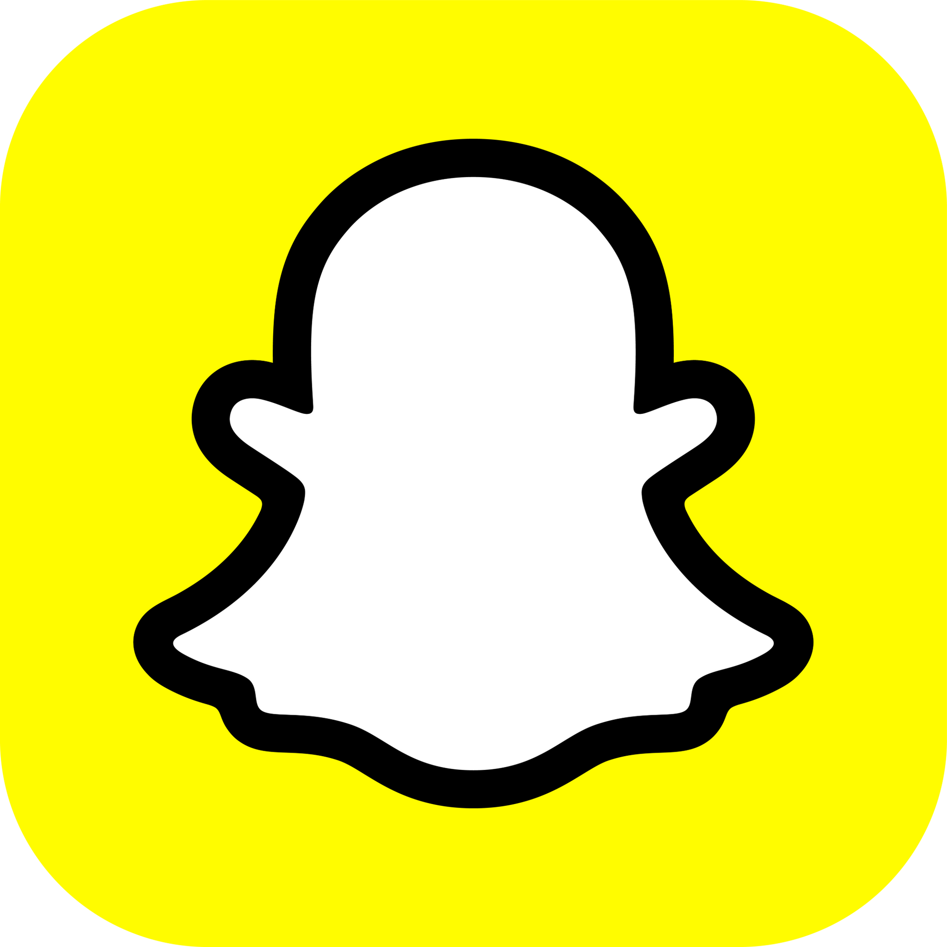
This type of logo uses a graphic icon or symbol. It can be a visual interpretation of the brand name or an object related to it.
Humans recognize and remember images much faster than words. So, a pictorial mark is a powerful way to stand out. The flip side is the logo must be able to fly solo (i.e. appear without text), which means the icon has to be unambiguous and instantly recognizable. The second a viewer has to squint to work out whether they’re looking at a tortoise 🐢 or a turkey 🦃, you’ve lost them.
That said, pictorial marks leave plenty of room for playfulness. For example, the Guild of Food Writers uses negative space to bring the concepts of writing and eating into their logo symbol.
Pictorial marks are frequently used by consumer brands, social media platforms and creative or tech startups.
Pro tip: Aim for a clean, iconic design that captures the essence of your brand in a single, memorable image. A pictorial mark is most effective when it’s simple, uncluttered and recognizable. Beware of clichès or overly obvious images, which could cause your brand to be mistaken for another.
Examples: Shell, Snapchat, World Wildlife Foundation, Playboy
4. Abstract logo mark

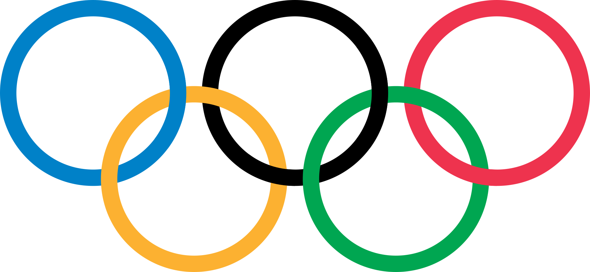


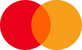
An abstract logo mark uses a geometric or symbolic shape but doesn’t directly represent a particular object.
When done well, abstract logo marks don’t need much interpretation. The Nike Swoosh is a good example: This logo conveys a sense of motion, speed and dynamism, which aligns with Nike’s brand message of athleticism, performance and achievement.
You can also use these logos flexibly across different media. Additionally, they enable the creative use of shape and color to evoke emotional responses, which can be a powerful branding tool.
Abstract mark logos are often attached to sports brands, financial institutions and established tech companies.
Pro tip: Design an abstract mark that aligns with your brand’s core values, purpose and positioning. While your logo might be abstract or geometric, it must convey meaning and resonate emotionally with your audience.
Examples: Adidas, Mastercard, Olympic Circles, Reebok
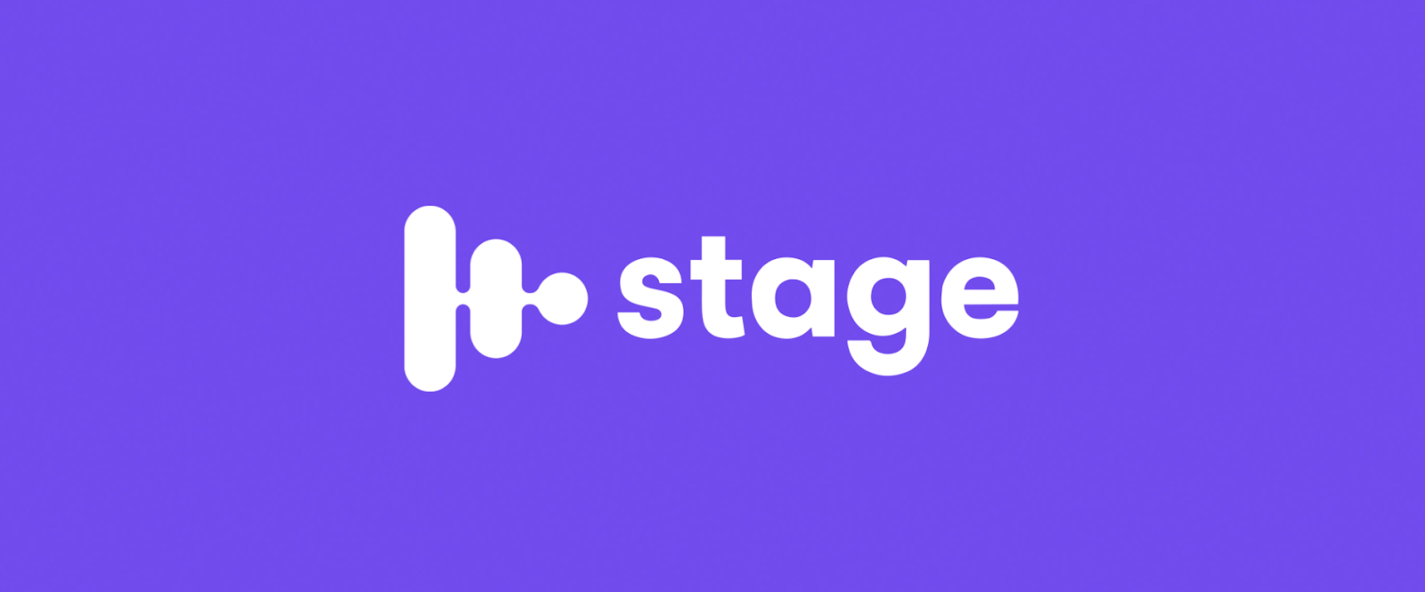
5. Combination Mark


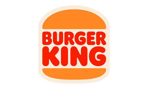

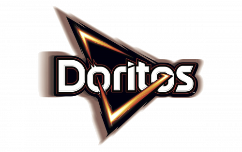
Combination mark logos (or just "combination marks") have a visual element—a pictorial or abstract mark—alongside a wordmark or lettermark, creating a combo of word and image.
A combination mark is often the first logo type designed for a new brand, embodying the business’s personality and identity from the outset. This type of logo allows you to build visual identity and brand name recognition simultaneously.
Pro tip: For a combination mark logo, aim for a cohesive design where text and image complement each other to tell a powerful, unified brand story. Remember that each element could also be used separately once you establish good brand recognition.
Examples: Doritos, Puma, Timberland, Burger King
6. Emblem Logo

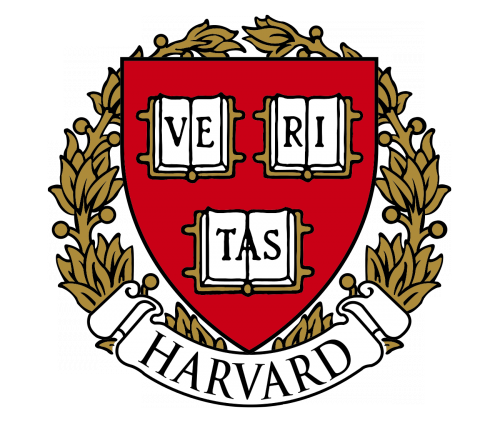

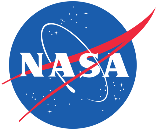
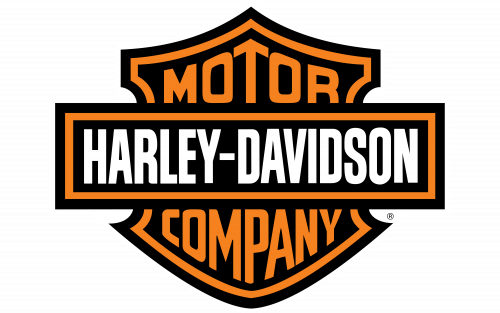
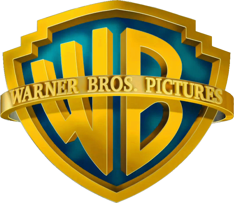
An emblem is one of the most formal types of logos. Emblem logos involve a combination of words and imagery that form a single unit, like a shield.
A successful emblem logo tells a story about identity, history and values. For this reason, they’re frequently used for shields and coats of arms. An emblem can also send a strong message about authority and longevity.
Emblem logos are common for universities, government departments, luxury cars, professional associations, and brands that aim to convey a sense of authority and stability.
Pro tip: An emblem logo needs to convey your brand’s history and ethos without compromising on clarity. You want to minimize unnecessary complexity, while still clearly communicating your brand’s identity and story. Keep scalability in mind: Emblems often appear on small business cards and merch as well as large billboards and digital screens.
Examples: Harley-Davidson, NFL, Harvard University, NASA
7. Mascot Logo

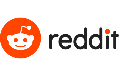

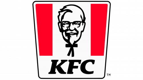

With mascot logos, a character image embodies the brand personality.
Mascot logos are playful and relatable. As a result, they instantly humanize a brand. They typically create positive emotional connections and can evoke playfulness and nostalgia.
Designing a good mascot logo requires strong character design and an excellent sense of the brand story. As with many of the other logos, the mascot logo should be recognizable and used consistently, no matter the platform or medium.
This type of logo has to evoke a universally positive emotional response, which can be surprisingly difficult to achieve. Done right, however, this logo type can take on a life of its own and build a strong brand identity.
Brands that want to appeal to children or those that want to evoke child-like feelings of playfulness or nostalgia may use this logo type.
Pro tip: Develop a mascot logo with a strong character and backstory that embodies your brand’s mission. You want your mascot to appeal to your audience’s emotions, fostering connection and engagement. Ensure your mascot design is unique enough to be recognized without the name attached.
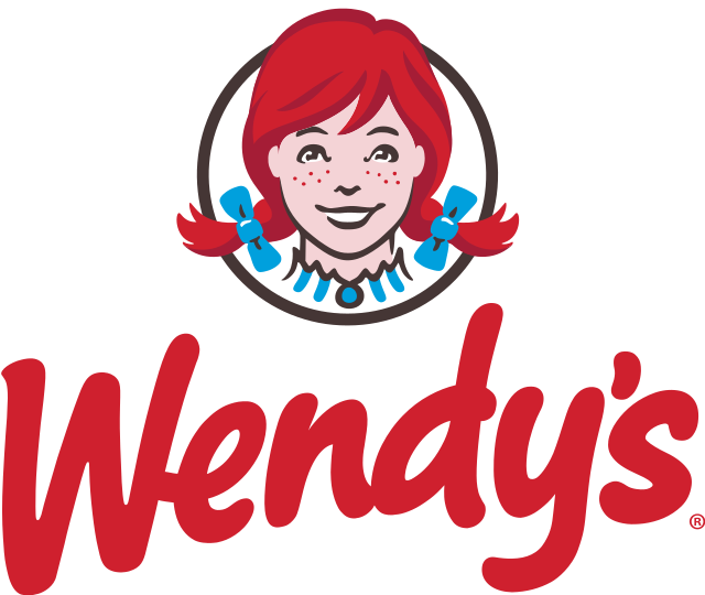
Examples: Mr Monopoly, KFC’s Colonel Sanders, Wendy’s, Reddit
8. 3D Logo

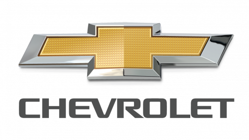

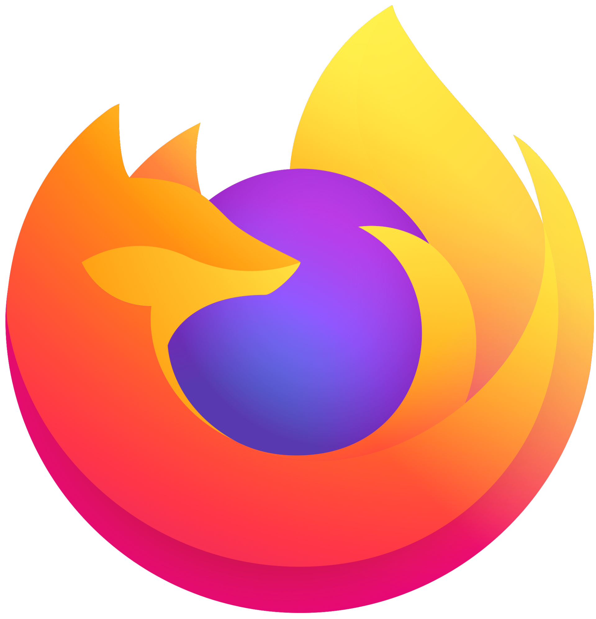
3D logos are designed to emerge from the page or screen, creating a real-world presence with the help of shadows, gradients and highlights.
A good designer can give a 3D appearance to any lettermark, wordmark, pictorial or abstract logo type.
You’ll most likely find 3D logos in the world of tech, cars and home appliances.
Pro tip: “Less is more” should be your mantra. Otherwise, this type of logo can become confusing. Static 3D logos can quickly become dated, so also keep an eye on trends if you choose this option. Combined motion graphics and 3D elements are on the rise right now, using rotating 3D symbols behind a fixed wordmark to convey a dynamic, future-oriented brand identity.
Examples: Chevrolet, Firefox, Porsche, LG
9. Dynamic Logo


Dynamic logos are a product of the digital age. As they’re not constrained to one colorway, orientation or shape, these logos adapt to different contexts and formats.
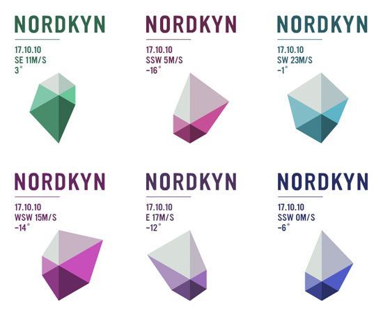
Dynamic logos are hyper-adaptable, which is why large brands with multiple subdivisions or cross-platform presences often use them. They can also reflect changing circumstances—a strategy used by Nordkyn Peninsula, a weather feed that alters its logo according to wind direction and temperature changes.
Dynamic logos are a good choice for creative, media and tech brands that want to communicate adaptability, creativity and innovation.
Pro tip: Ensure your dynamic logo has consistent core elements, keeping a golden thread of recognizability and brand identity. You need clear guidelines for which elements will be fixed versus flexible, so you don’t dilute your message.
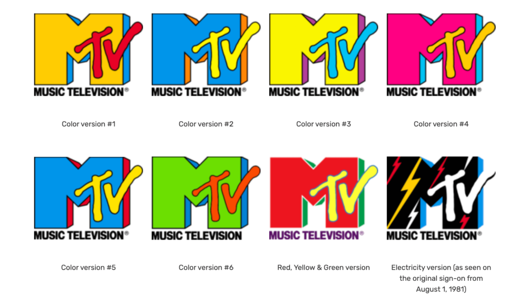
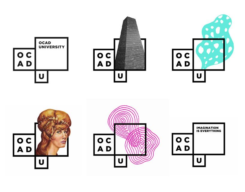
Examples: MTV (multiple colorways), Nickelodeon (multiple platforms), OCAD University
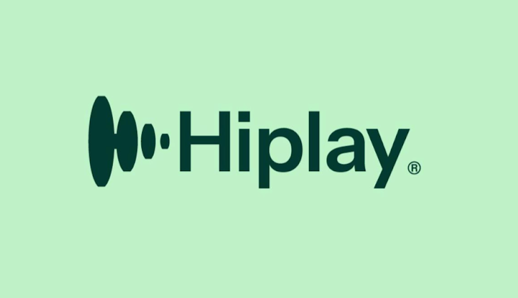
10. Animated Logo


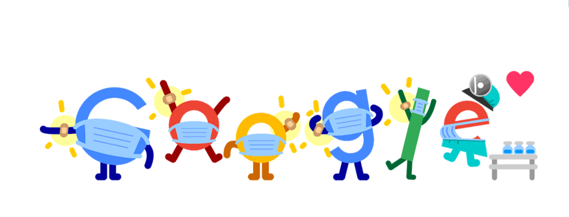

This logo type, which always includes motion graphics and often includes interactivity, is becoming increasingly popular.
Animated logos with special effects have recently opened up an exciting world of hybrid design, where movement is combined with 2D or static elements (have a look at what Hiplay did) or the viewer is invited to play and participate (here, Google reigns supreme).
These logo types are usually associated with tech, creative and design brands showing off their adaptability and technical skills.
Pro tip: Motion brings flexibility and adaptability, but make sure your animated logo keeps the spirit and identity of your brand’s static logos. You want seamless consistency and recognizability across all formats.
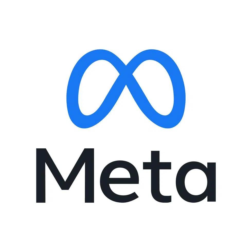
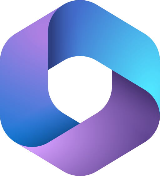
Examples: Google Doodles, Microsoft 365, Meta, Shazam

Join 30,000+ high-performing professionals and receive the best design and marketing content, weekly.
5 Trending Logo Types for 2024
Logo trends often reflect the target audience’s current design and aesthetic preferences. Adhering to current trends can help your logo appear contemporary and relevant, which can be especially important in industries where staying up-to-date is crucial.
Prinsloo shares the types of logos we can expect to see this year.
1. Text Assortment Logos


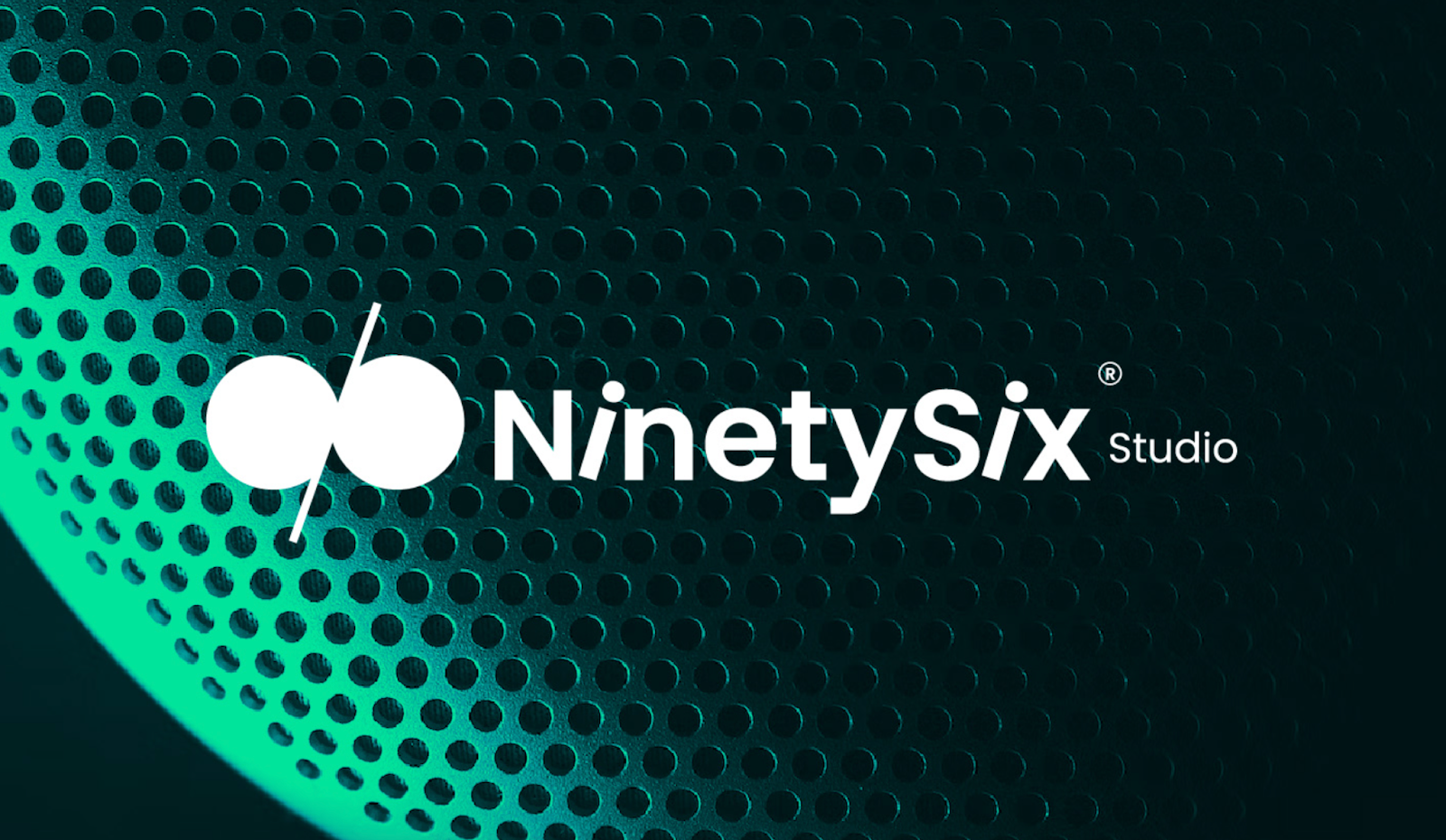

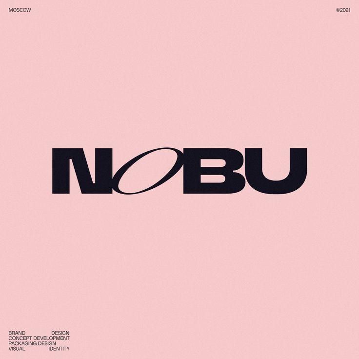
Just because you’re running with a wordmark logo doesn’t mean your design must be constrained by uniformity, Prinsloo notes.
Enter the text assortment logo. “This mix-and-match approach involves playing with various typefaces to craft diverse designs that deviate from the conventional corporate aesthetic.”
Examples: Nobu, NinetySix Studios, Fabrik
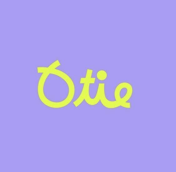
2. Lowercase Lettering

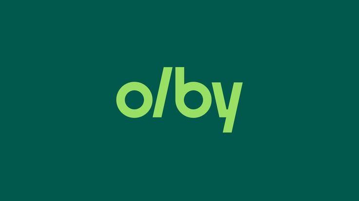


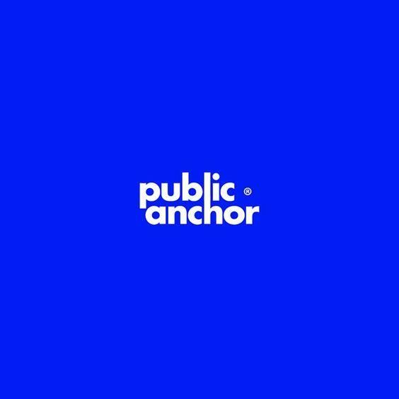
Lowercase lettering in wordmark or lettermark logos emphasizes accessibility and minimalism.
This trending logo type is “playful, inviting, approachable and youthful,” says Prinsloo. If this echoes your brand personality, lowercase lettering could be a fantastic choice.
Examples: Olby, Public Anchor, Tumblr
3. Animated and Special Effects


Animated logos have been around for a while (remember the first Google Doodle created for Halloween 2000?). The emerging trend is to create a “360-degree visual fiesta” as opposed to simply adding movement to a static image, Prinsloo notes.
A major logo style trend for 2024 is the combination of flat, vector-based logos with animated or 3D elements, giving brands the best of both worlds.
Color-wise, slick gradients and multicolor vibrancy are leading the charge.
4. Minimalism
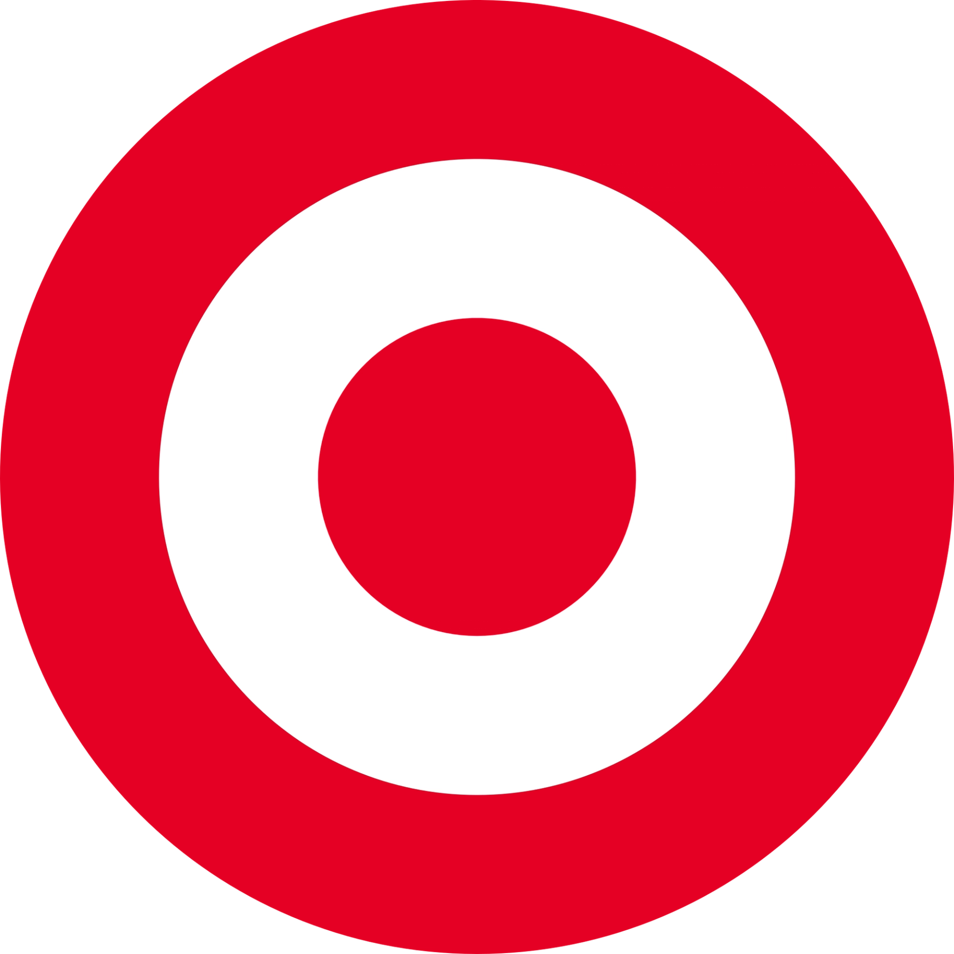

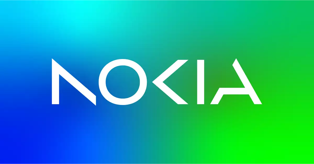

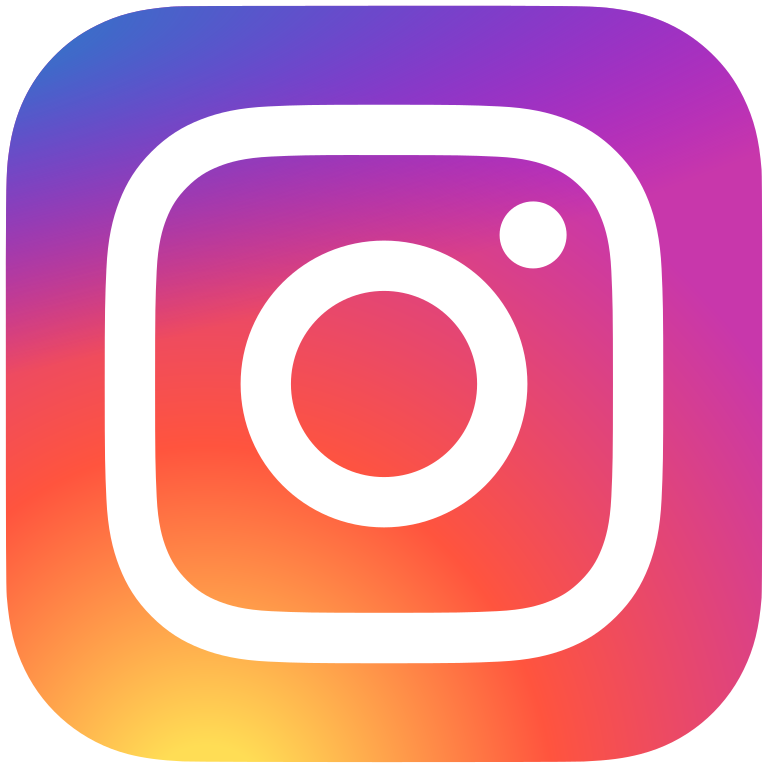
Abstract mark fans, your time has come. You’ll see many established brands opting for minimalist logo redesigns.
The result? Concise, chic, impactful logos.
Examples: Nokia, Instagram, Target
5. Handwritten and Imperfect


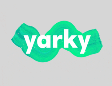
In a world where it seems we’re never sure what’s real and what isn’t, it’s no surprise logos are taking a nostalgic trip back to handwritten charm, doodles and embracing the unconventional and odd, says Prinsloo.
The only rule is rules are made to be broken. “Keep an eye out for logos that embrace the imperfect, including handwritten scribbles, fluidity and distortion.”
Examples: Yarky, Klapp, Centre for Social Innovation
Choosing the Right Logo Type for Your Business
Logo design can be complex, and getting the world to sit up and take notice of a brand is definitely hard. After all, the average consumer is exposed to so much noise.
But starting with the right logo type and doing trend and competitor research can set you on the right path.
Need help with your logo design? Superside offers flexible logo design services to help you stand out from the crowd, whether you’re looking for a brand new identity, quick refresh or total overhaul. Book a call to discuss your creative needs.


Give Your Marketing Team the Power to Boost Your Brand
Distribute your content across every channel with our effective design ops platform. Unlock seamless content distribution, access your audience.

Don’t miss anything!
Join our community of 40,000+ who receive the best in design and marketing content, weekly.
Why choose Creative-as-a-Service with Superside?


Improve your marketing performance
Get high-quality creative, ship campaigns faster and stand out from the competition.

Be more agile & responsive
Never say no to another project request. Get a hassle-free creative partner that can keep up.

Elevate your team
Allow your in-house creatives to focus on more strategic projects. Get new ideas & continuous design inspiration.

Save time & be more cost-efficient
Increase your design capacity without additional hiring and with fewer vendors to manage.
See Superside in action
Get a demo and discover how 450+ ambitious companies and 2,500 energized fans use Superside to free themselves from the shackles of limited budgets, broken processes and stretched in-house teams.