


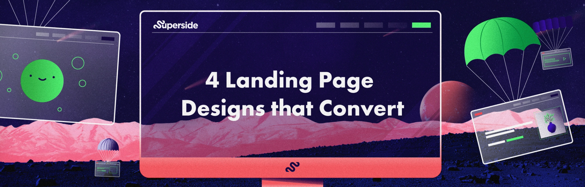
4 Landing Page Ideas to Drive More Conversions


Are you looking to grow your email list? Drive more sales? Get more attendees for your next event? A landing page can help you do all that and more—if you nail the design.
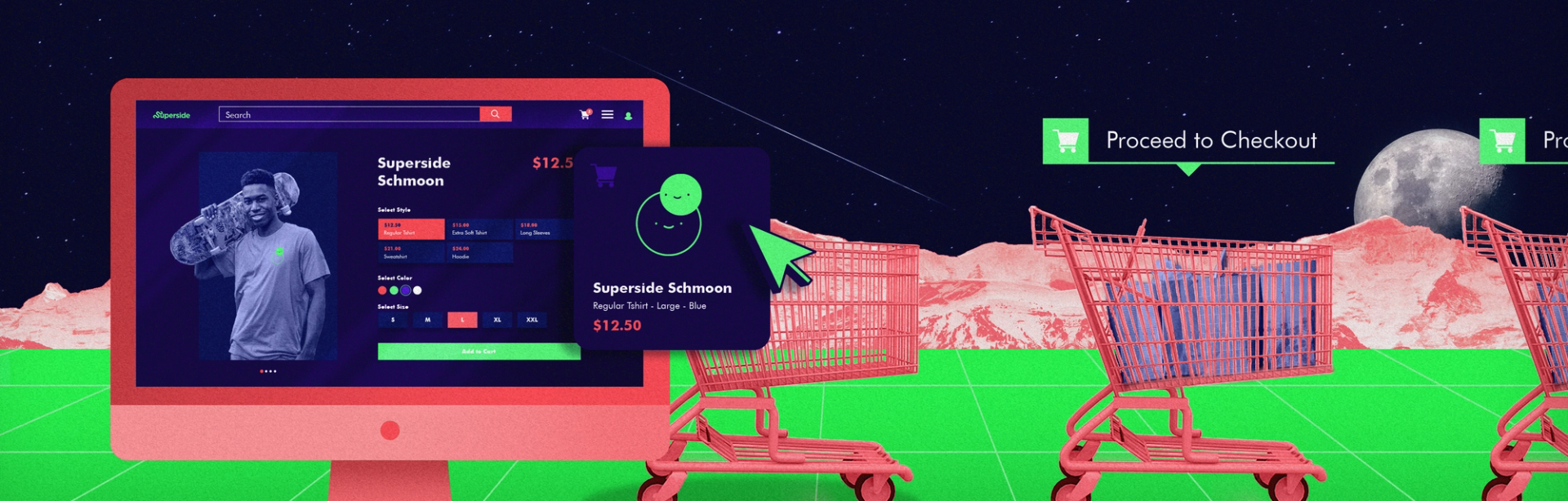
What exactly is a landing page, you ask? If you’re unfamiliar with the concept, a landing page is a webpage that a person “lands'' on after clicking on an ad, an email link or some other digital channel. The landing page should encourage users to take a particular action, such as subscribing to your email list, signing up for a free trial or purchasing a product.
Landing pages work by eliminating the paradox of choice, which is the idea that having too many options to choose from, rather than making us happier, can cause stress and lead people not to choose anything at all—also known as “analysis paralysis.” Compared to a website homepage which has many different next steps for users, a landing page should just have one single call-to-action. Keeping things simple and focused ensures that your viewers don’t get distracted from the choice you want them to make.
Now that you understand what a landing page is and how it works, we want to help you nail your design with our landing page design services. Keep reading for some design best practices and some landing page ideas to help inspire your next campaign.
Landing Page Design Tips
- Keep it simple and minimal. A good landing page doesn’t need a lot of bells and whistles. The best ones have very clean, simple layouts with plenty of white space to keep people focused on your offer and call-to-action.
- Use contrasting colors. Using contrasting colors for your backgrounds and buttons – like a dark navy paired with tangerine orange – will help your CTAs really pop, which will visually guide your user to take the desired action.
- Keep your most important info above the fold. If your users have to scroll too far to find the information they need, you’ll lose ‘em. Make sure to include a headline and a CTA right at the top of the page. You may also want to include a brief sentence or two of body copy if you feel the need to add more context or information.
- Add trust signals. Testimonials, reviews, usage statistics, and company logos act as stamps of approval which can help reassure visitors that your offer is as good as you say it is and encourage them to take the next step. Just make sure that these elements don’t distract from your offer. Some companies decide to put testimonials right at the top in the header, while others may include them below-the-fold as a means of social proof.
- Add video. Experts say that a direct face-to-face’ conversational format that directly addresses the viewer/prospect and focuses on the ‘big idea’ of the page works best. They also recommended adding some low-volume background that can help make the video more engaging (and mask audio inconsistencies) and captions so your page visitors can still watch with the sound off. For more on this, we love this article by Wistia that shares tips for how to use video on landing pages to maximize conversion (and delight).
Landing Page Ideas with Examples
It’s one thing to learn about what makes a great landing page – it’s another to see one in action. Lucky for you, we put together this quick list of landing page examples that you can use to help inspire your next project (or spruce up any existing landing pages!).
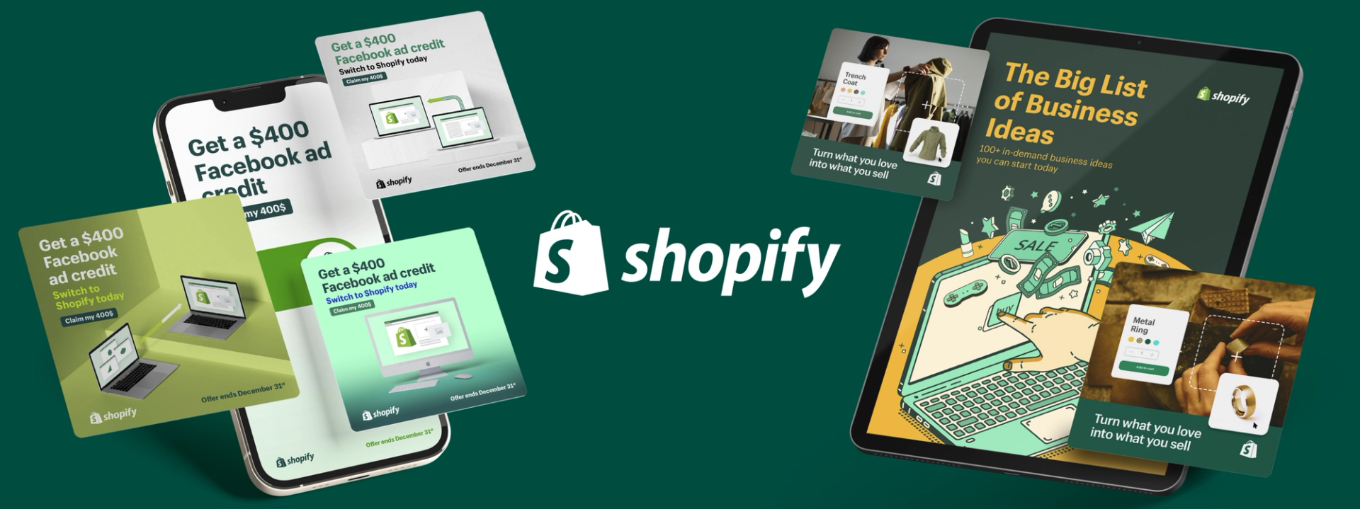
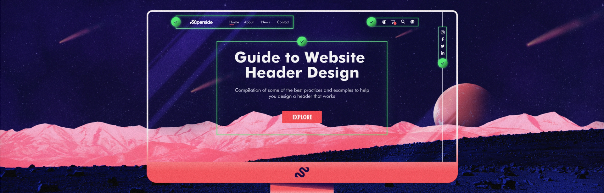
1. Thinkific: Straightforward Messaging and Clear CTA
Why it works:
- Strong hero image: The visual of an athletic woman popping out of a web browser page in the website header is a great visual representation of how Thinkific helps creators turn their knowledge and experience into digital courses.
- Contrasting colors: The orange CTA button really pops against the blue background, drawing the users’ eye directly to the action Thinkific wants them to take (“Start a free trial”).
- Social proof: The landing page includes captivating statistics (“50,000+ course creators using Thinkific, $650 million+ earned on our platform”) to generate FOMO and underscore the offer’s value.
- Optimized above-the-fold section: The rest of the page includes more information about Thinkific’s subscription plan and how it works, but the above-the-fold contains the critical info user would want to see to make a decision: a strong headline, clear CTA, and social proof.
2. HoneyBook: Building Trust Through Social Proof
Why it works:
- Contrasting colors: The dark background with white text and teal CTA button makes the page easy to read and directs the page visitor to take the desired action of starting a free trial.
- Product screenshots: HoneyBook gives visitors a peek into the product’s user interface by including screenshots on the landing page, coupled with illustrations for added visual interest.
- Trust signals: The landing page includes customer logos (greyed out to fit with the visual language of the page) and customer testimonials to build trust.
- Video: HoneyBook includes video customer success stories that act as an additional trust signal and add a human element to the page.
3. Wistia: Colors and Visuals that Pop (& Video!)
Why it works:
- Eye-catching colors: This ain’t your average landing page. The bold and vibrant colors and hero video immediately draw the viewer in.
- Clever copy: The conversational copy and show business references (“There’s no business like your business”) really highlight the brand’s friendly, down-to-earth personality.
- Video, video and more video: The landing page peppers high-quality trailers throughout the page, enticing users who need a little more info before they commit by giving them a taste of what they’re going to get when they sign up.
4. Notion: Using Illustration and Motion to Stand Out From the Crowd
Why it works:
- Use of illustrations: Notion uses illustrations in the hero and throughout the landing page that add a touch of whimsy and visual interest.
- Motion graphics: Instead of using screenshots, Notion uses animations to give viewers a more engaging and true-to-life idea of what it’s like to use the platform.
- Social proof: The landing page features customer logos, testimonials, and tweets from real Notion users to add credibility.
Final Landing Page Design Advice
Landing pages can be a powerful tool to generate leads and drive sales, but the wrong design can seriously hurt your conversion rates. According to research from Adobe, 38% of users will stop engaging with a website if they find it unattractive. Remember: the best landing pages are simple, minimal, and focused. While you can (and should!) consider adding some video or graphics to make your page pop, a landing page isn’t the place to spend a ton of time educating your audience on who you are and what you do.
From the copy to the design to the CTAs, everything on your page should support one common goal: driving conversions.

Don’t miss anything!
Join our community of 40,000+ who receive the best in design and marketing content, weekly.

Why choose Creative-as-a-Service with Superside?

Improve your marketing performance
Get high-quality creative, ship campaigns faster and stand out from the competition.
Be more agile & responsive
Never say no to another project request. Get a hassle-free creative partner that can keep up.

Elevate your team
Allow your in-house creatives to focus on more strategic projects. Get new ideas & continuous design inspiration.
Save time & be more cost-efficient
Increase your design capacity without additional hiring and with fewer vendors to manage.
See Superside in action
Get a demo and discover how 450+ ambitious companies and 2,500 energized fans use Superside to free themselves from the shackles of limited budgets, broken processes and stretched in-house teams.