


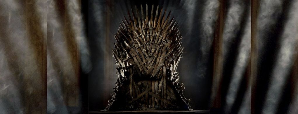


At Superside, we design and we know things. Our community of designers, art directors, web whizzes, writers and account managers is super-talented – and full of nerds. Though we come from all four corners of the earth, our love of great design and pop culture binds us together. We’re especially fond of a little show you might have heard of: Game of Thrones.
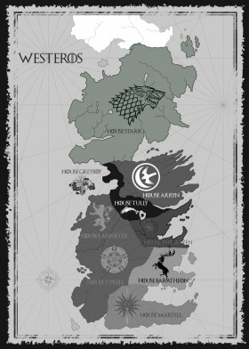
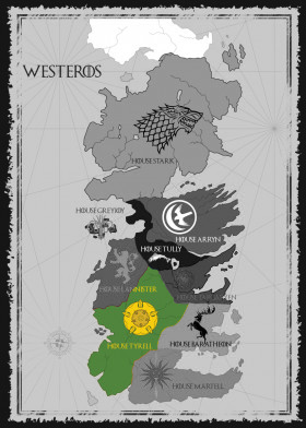
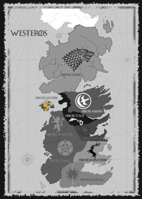
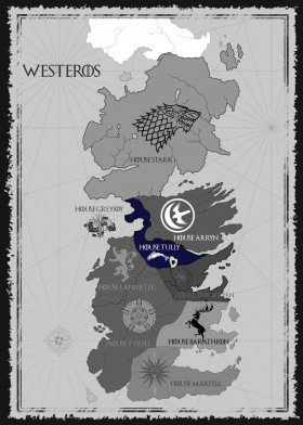
With the premiere of the final season of Game of Thrones in action, we decided to take a look at the design and branding of the Great Houses of Westeros. We’ll break down the good, the bad, and the ugly of each house. Don’t worry if you don’t remember Bran’s lessons with Maester Luwin, we’ll remind you of each house’s important details too.
The sigils of each house are based on an animal or element from their region that represents who they are and what their house stands for. George R. R. Martin and the HBO team have done a great job with the colors and design of each sigil as well. The colors are all highly indicative of each house’s geographic location, with earth tones representing more rural houses and bold, bright tones representing the houses from the great cities. These choices are historically accurate as well, since bolder, brighter dyes were harder to come by in rural areas and would have been easier to acquire closer to the warmer climate of Essos.
WARNING: This post is dark and full of spoilers, so if you aren’t caught up to the end of Season 7, proceed at your own peril.
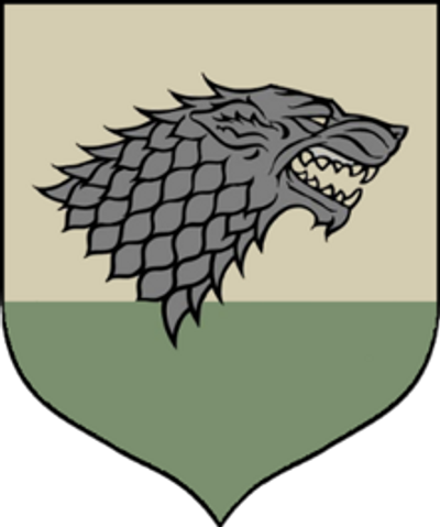
Let’s start with the big dog – literally. The sigil of House Stark is the fearsome Direwolf, which – like the Starks – rarely leave the North and are fiercely independent but also unfailingly loyal to their pack.
The stylized direwolf represents the Stark family brand quite well, with sharp lines that make its coat appear armorlike. The earthy green conveys strength, reliability, nature and honesty – all notable Stark traits.
The symbol itself is as direct and unfussy as the Starks themselves. The wolf speaks for itself without flourish or embellishment, representing guardianship over the North and the Wall as well as family, loyalty, and instinct.
The Stark banners unfurling triumphantly down the walls of Winterfell after the Battle of the Bastards was a standing ovation moment for fans (admit it, you cheered), but it’s unlikely that the Stark children will get to keep hold of Winterfell without at least one more big, nasty battle, this time against even greater odds.
The Stark words, “Winter is Coming” aren’t a weather prediction. They are a reminder to always be prepared for whatever the world may throw your way. A good slogan for the Starks, and one which has proven grimly true. But it’s another Stark saying that will likely be the key to survival for Arya, Sansa, Jon, and Bran, “The lone wolf dies but the pack survives.”
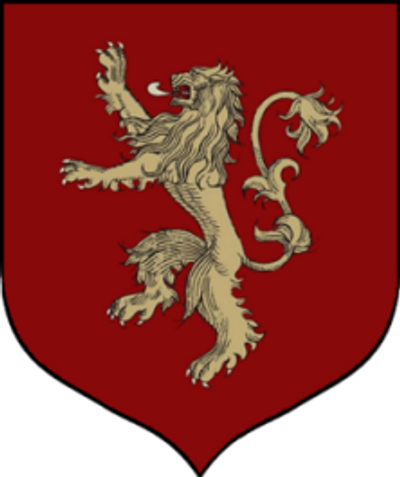
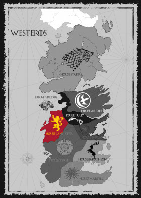
The Lannister Lion is as baroque as the Stark Direwolf is simple. All flourishes and scrollwork, the intricate golden lion emblazoned on a bold red banner eschews practicality for decadence, making it clear that the Lannisters are a regal and prosperous bunch rooted in tradition.
Everything about the Lannister sigil screams “money and power.” Which is exactly what the Lannisters are going for, of course.
The lion standing upright represents majesty, aggression, courage and military might. The rich, red background represents love, anger, boldness, determination, desire and passion. The golden lion, of course, represents the gold that the Lannister family is famous for having so much of.
The Lannister words, “Hear Me Roar” stick with the lion theme, but the more accurate family slogan is probably the better-known, “A Lannister Always Pays His Debts” which is both a promise and a threat.
Every time it seems that the Lannisters are about to crumble, they seem to find a way to grab even more power. This time, however, Cersei may be on her own. With one brother sworn to her enemy and the other on a redemption arc that may well place him side-by-side with Tyrion, standing against her, we can’t wait to see which (if any) Lannister(s) are left standing.
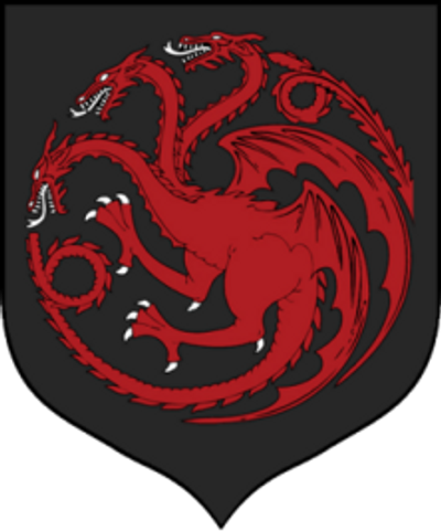
The Targaryen dragon is, hands down, the most intimidating of the house sigils. The family that conquered Westeros from the backs of dragons aren’t shy about displaying what makes them special.
Dragons traditionally symbolize potent, auspicious power and strength. The black represents elegance, sophistication, night and deat, while the red represents warmth, anger, boldness, excitement, strength, passion and determination.
From a design perspective, the three-headed dragon is stunning and almost hypnotic, with a great sense of movement and balance as the dragon’s body curves to form a circle. It uses radial symmetry to give it balance, and the circle may represent the wheel of power that Daenerys plans to break.
The Targaryens aren’t exactly what you’d call subtle, as shown by their straightforward slogan, “Fire and Blood.” Daenerys might want to think about softening that and giving her family name a bit of a rebrand as she seeks to win the hearts and minds of the people of Westeros.
It is fitting that Dany crosses the Narrow Sea with three dragons, just as her ancestors once did. Although she’s now down to just two of her fiery children, (RIP Viserion) we doubt she’ll be changing the banner anytime soon.
As for the Targaryen bloodline, thought to be ending with Dany, the showrunners have laid a lot of hints on us that suggest we can expect a double Targaryen baby to come out of her union with Jon Snow.
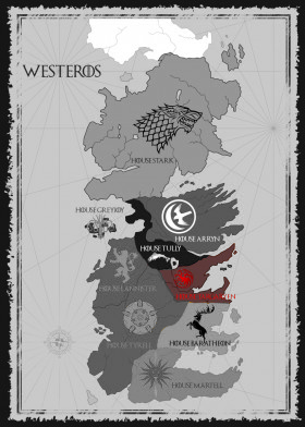
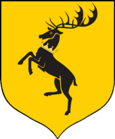
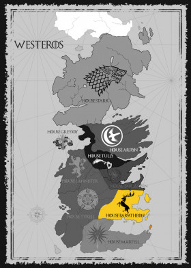
The first time we meet Tywin Lannister, he is field dressing a large stag… Unfortunately, the Baratheon family doesn’t fare much better.
The stag is traditionally seen as the king of the forest and protector of all other creatures. For the native tribes of North America, the deer was a messenger, an animal of power, and a totem representing sensitivity, intuition and gentleness.
House Baratheon is the youngest of the Great Houses at the start of the show. This is evident in the design of their sigil, which has a sleek, minimalistic, high contrast look with fewer lines and detailed elements than the traditional sigils – all of which gives it a more modern look than those of some of the ancient houses.
The colors were clearly chosen with royalty in mind. The black represents formality while the yellow/gold is associated with courage, magic, wealth and grandeur.
The stag rearing up on a field of gold with a crown around his neck is almost reminiscent of the real-life Ferrari logo, which seems quite appropriate for the hard partying, warrior king who never quite adjusted to the idea of actually ruling the kingdom he conquered.
As each of the Baratheon Bros laid their claim to the throne, they put their own twist on the family logo, adapting it to match their personalities but keeping the stag. Stannis’ banner placed the stag inside a burning heart to proclaim his newfound religion while Renly’s banner featured the stag’s head on a field of forest green.
While “Ours is the Fury” is a good slogan for the Baratheon clan, perhaps “Live Fast, Die Young” would have been more appropriate.
Though they’re mostly extinct at this point, we might see a rebirth of House Baratheon now that Gendry is aware of his true parentage and ready to fight alongside Jon Snow.
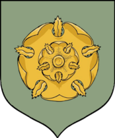
Although Lady Olenna Tyrell is more than a little sick of the Golden Rose of House Tyrell, the stylized rose is actually a perfect symbol to represent the Tyrell family.
The rose is well designed; elegant, geometric, detailed yet organic, and perfectly aligned with repeating, radiating petals. Perhaps this is why the Tyrells stick their logo on everything from handkerchiefs to chamber pots.
The gold speaks to their wealth and power as the Reach is second in size only to the North. The Rose itself, the green of the background, and their house words, “Growing Strong” all ostensibly speak to the fact that the agricultural exports from the Tyrells’ lands are indispensable to the rest of Westeros.
The Rose is actually a perfect symbol for the family itself as well: a strong flower whose beauty hides its thorns quite well. The Tyrells themselves do seem to have the best interests of the realm at heart but – when it comes to power and politics – they are every bit as cunning and manipulative as the Lannisters. The Tyrells prefer a far more subtle approach, though, striking a pragmatic balance between the Starks’ honor and the Lannisters’ ruthlessness.
Unfortunately, even master strategists can’t plan for a crazy lady blowing up half of her own city and this once great house has fallen at the feet of Cersei’s wrath, their land and holding seized by the Lannisters. It’s doubtful that any of the Tyrells will resurface in the final season, but at least Olenna went out like a badass (RIP Olenna).
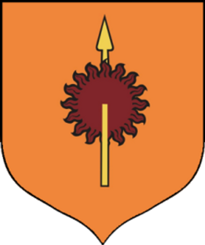
The sigil of House Martell is actually a fusion. The original Martell sigil was simply a yellow spear. The red sun was the symbol of Princess Nymeria and was added to the Dornish sigil to symbolize the marriage of the warrior-queen to Mors Martell.
The house words, “Unbowed, Unbent, Unbroken” represent the fiercely independent nature of the Martell family and the Dornish people who have been largely isolated from the rest of Westeros, and draw many influences from the warmer, exotic lands in the south and east of Westeros.
Unfortunately, the fortunes of the Martell family haven’t quite lived up to their family slogan (Yes, we’re still mad about the Viper vs the Mountain – RIP Oberyn). Legally, House Martell is extinct, although the few remaining Sand Snakes still use the Martell crest. Hopefully we’ll see them get some revenge in the final season.
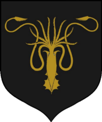
The Greyjoys have saltwater in their veins and it shows. Their house sigil, the Kraken, symbolizes their ‘piratey’ family ethos as do their house words “We do not sow.” The Greyjoys, like the Kraken, are masters of the sea and take down enemy ships with ease and near impunity. Good branding for a house of pirates looking to strike fear into the hearts of anyone they meet, whether on land or sea.
The symbol itself is completely symmetrical with a strong use of negative space. The tentacles extend out just like the Greyjoy’s ambitions. The black background symbolizes death and morbidity but also makes the deep gold monster stand out for high visibility on the high seas.
The Greyjoy family rules over the Iron Islands and as their slogan indicates, they’re not big on farming, industry or paying for goods and services. Instead, they prefer to take what they feel is theirs from others. Hence the pirate comparison.
The fate of House Greyjoy is shaky at best at the moment. Yara is being held captive by Euron, and Theon has assembled the last of her men to rescue her. If he succeeds and they manage to defeat Euron, it will be interesting to see if the Ironborn maintain their allegiance to the Lannisters.
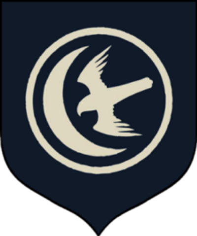
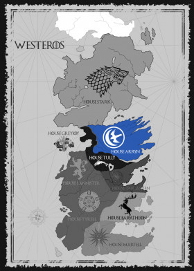
The sigil of House Arryn is a falcon and a moon, both of which are consistent with their house words, “As High as Honor.” The operative word there is ‘High’. House Arryn has ruled over the mountains for hundreds of years and the Eyrie, the ancestral seat of the Mountain Kings, is an impregnable fortress set dizzyingly high in the mountains of the vale.
The blue represents professionalism, loyalty, reliability, honor, trust, boredom and coldness – perfect for the aloof and slightly pompous Arryns.
The sigil itself stands out from those of the other houses, with a somewhat more modern and stylized design, despite the age of the house. In form it is very calculated and all about precision. The curves of the falcon’s wings and the moon match with equal negative space between all of the elements, giving it a sharp, clean look.
The falcon is a reference to an old Arryn legend that Ser Artys Arryn, the Winged Knight flew atop a giant falcon to land on the highest mountain of the Vale and defeat the last of the Mountain Kings.
The defacto ruler of the Vale until recently was Petyr Baelish, who was to hold power until Lord Robin came of age. Since Littlefinger’s incredibly satisfying demise, however, the fate of House Arryn is back in the hands Robin Arryn, though control of their formidable armed forces will likely fall to Yohn Royce.
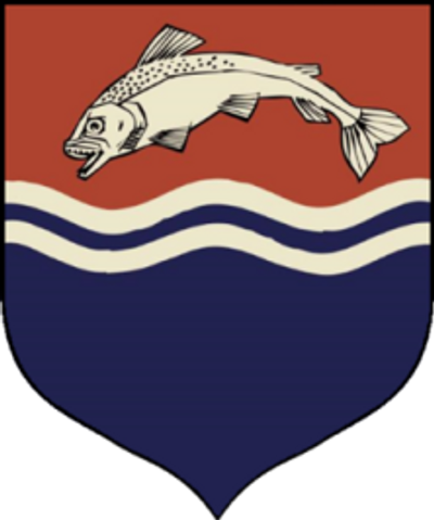
The Tully sigil is a silver trout leaping out of the blue water against a red background. Both the fish and the river in the Tully sigil are representative of their place as Lords of The Riverlands.
The house words, “Family, Duty, Honor” are as direct and straightforward as the Tullys themselves. A list of priorities to live and die by.
The design of the Tully sigil stands out from the rest in its use of multiple colors. The blue represents loyalty and honor and is balanced by the red, which represents passion and strength.
Brynden Tully, better known as The Blackfish, adopted the trout as his personal sigil simply by changing the color. Despite having a fish as their sigil, the Tully’s aren’t a family to be trifled with and, in fairness, the trout itself is pretty fierce, as trout go.
The bloodline of House Tully survives in Edmure and his child, although they have been officially deposed and stripped of land and titles by the Iron Throne. As the saga comes to a close, the fate of House Tully will – like most of the other houses – depend on who ends up on the Iron Throne.
Your business is your house. Your logo is your sigil and your slogan is your house words. Your logo is the face of your brand and it should represent you as such. When designing your logo, you need to think about how your customers will receive it and what it says about your business. Is your business lavish and ostentatious like the Lannisters, or simple and straightforward like the Starks? Do you want to project an image of power like the Targaryens, or to inspire trust like the Tyrells?
Just don’t make your logo a corpse, like the Boltons. Seriously. Ew.
When you’re crafting a brand identity, there are a lot of moving parts and factors to consider, from choosing the right voice to selecting a killer color palette. You need experienced professionals who know the ins and outs of design and branding.
Superside can help. Our team is made up of professionals from all over the world with extensive experience in branding and design. You’ll be paired with an account manager who will put together a dedicated team of specialists based on your needs. Our model helps you get incredible results in less time than working with a traditional firm, and at lower cost.
Winter is Coming. Be prepared and make sure your house is in order. We can help.
Join our community of 40,000+ who receive the best in design and marketing content, weekly.
Get high-quality creative, ship campaigns faster and stand out from the competition.
Never say no to another project request. Get a hassle-free creative partner that can keep up.
Allow your in-house creatives to focus on more strategic projects. Get new ideas & continuous design inspiration.
Increase your design capacity without additional hiring and with fewer vendors to manage.
Get a demo and discover how 450+ ambitious companies and 2,500 energized fans use Superside to free themselves from the shackles of limited budgets, broken processes and stretched in-house teams.