


The Evolution of Taylor Swift Album Cover Design


brandTaylor Swift. From America's sweetheart to badass superstar. We're talking about her brand identity, how it changed, and the revolution we saw play out across her six album covers.
The curly-haired, country music teen who was introduced in 2006 under her first hit single, “Tim McGraw” has undergone drastic changes in her brand, personal image and music. The most notable and talked-about transformation is the artist’s complete shift from country to pop. Her six album cover designs are examples of her brand revolution--from sweet country princess to bitchin' pop superstar.
Font type, color scheme, images, and logos contribute to her revolution. With every new album release, Swift demonstrated a change in design that, to this day, speaks volumes of her evolving brand and musical identity.
Let’s take a look at Swift’s iconic brand metamorphosis and how it is reflected through each of her six strategically-designed albums covers.
The Album Revolution
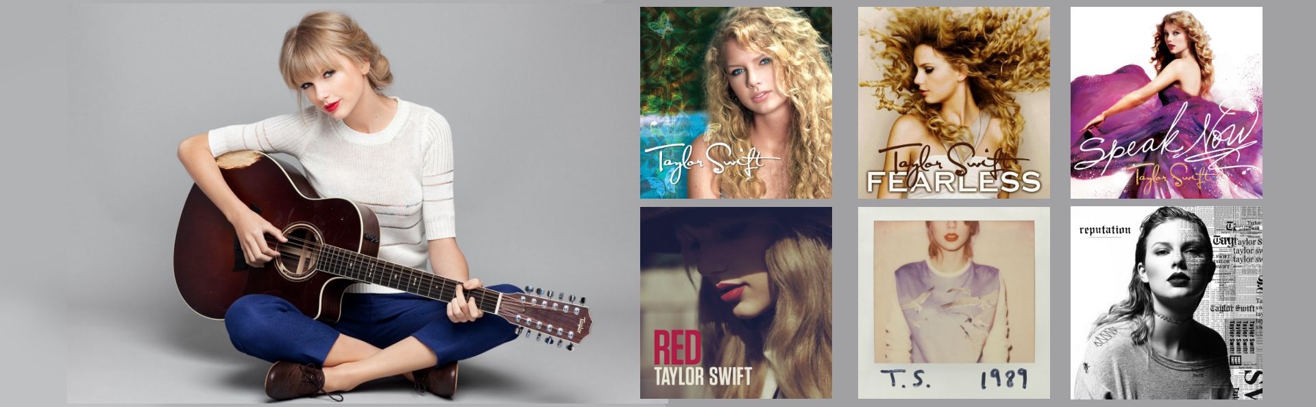
1. Taylor Swift, 2006
At the time of her first album release, Taylor Swift was a sweet, angelic country music star who wrote her own music and had taken a chance on a new record label. You can see from this first cover that the theme is quite elegant with many feminine characteristics. The album title is written in a graceful, cursive white font that compliments the image of a youthful Swift, sporting her once signature blonde curls. This album certainly highlights where the singer was in life at the time: an innocent and youthful high school girl aspiring to be a country music artist.
The color scheme of this album also speaks to the country vibe that Swift embodied in her early years. The colors are earthy – blue, brown, green, and white – making it easy for viewers to think of nature and the countryside.
Takeaways:
Swift’s first album cover portrays her as a young, innocent, feminine, country music artist. In regards to her personal image, her big curly hair and natural, simple makeup attest to the down-home, girl-next-door image. It worked for her debut as she became the youngest person ever to receive the Nashville Songwriters Association's Songwriter/Artist of the Year in 2007 award and single-handedly write and perform a number-one song on Billboard's Hot Country Songs chart.
2. Fearless, 2008
Only two years after her debut on the world stage, Swift’s second album, Fearless immediately showed a difference in design and brand, although it held true to some features from her debut.
This album is more minimalist than the first. The most prominent feature of the album cover is Swift’s long, curly mane. The color scheme is a mature beige, whereas the first album illustrated rather innocent blue and green colors. The font is bold, possibly referencing the artist’s "fearlessness"; however, she kept her feminine, elegant font type for her name that is a signature from her country albums.
As for the album’s music, Swift remained true to her country roots, but was more inclusive to a pop audience. The biggest hit on this album was "You Belong with Me," a song that reached number two on Billboard’s Hot 100 and earned the star three Grammy nominations.
Takeaways:
Both the music and album cover are a testament to the youthful, hopeful country singer that growing into herself. It was reminiscent of holding hands after school, passing notes, and first dates. The songs also suggested a coming-of-age moment for Swift – both as a young woman and as a superstar.
3. Speak Now, 2010
From co-written to entirely written by Swift, it seems appropriate that this album cover incorporates handwritten script to demonstrate Swift’s massive role in producing this album. The cover design is still very feminine, with a graceful Swift spinning in an elegant purple dress.
The album’s music was still considered Country, but the pop inspirations increased. Nevertheless, the woeful country twang in the album’s hit songs, including "Back to December," "Mean" and "Mine" was still prevalent. These songs successfully embodoed the raw feelings of young heartache while other songs on the album, such as "Enchanted" and "Sparks Fly" were fairytale-like odes to innocence as mirrored on the cover.
Takeaways:
We can infer from this album that Swift’s brand identity was still youthful, innocent, and "girl next door" because it incorporated feminine colors, elegant font type, and other graceful qualities. It also maintained her signature font that defined her brand, but two years later would evolve from sweet to bold.
4. Red, 2012
If Swift’s prior incorporation of pop into her predominantly country music was her simply dipping her toes in the water, then this album was a full-blown cannonball. Swift’s 2012 Red album marked the farewell to the curly-haired teenager and a "hello" to the mature young woman with her never-before-seen bold lips and straight hair. Everything about this album – from the cover design to the music – demonstrates the biggest transformation to the artists’ brand that was seen up until that point.
Long gone are the days of Swift’s signature handwritten-style logo. This cover reveals big, bold sans-serif font in white and red, perfectly complimenting the red lipstick. Red features pops of its namesake color on a desaturated background indicating a serious change in brand. After all, what better way to debut a new identity than in a bold, unapologetic color?
Takeaways:
This album introduced some of the most iconic hit songs of the time: "Red," "22," "I Knew You Were Trouble" and "We Are Never Getting Back Together." Often dubbed a coming-of-age album, Red confirms Swift's transformation from a feminine, youthful brand to the bold, confident brand of a megastar, and from America’s country sweetheart to a powerful force of nature in the pop music industry.
5. 1989, 2014
Swift’s 1989 album marked the moment when the singer officially cut ties with her country roots and fully immersed her musical craft in the pop genre. As her hit song "Shake It Off" suggests, Swift certainly had no problem shaking off her country girl persona.
Iconic songs like "Blank Space" and "Bad Blood" catapulted the star even further into the limelight as a confident, strong woman – so confident, in fact, that she is famous for actually using the gossip and rumors about her in her own music. "Blank Space," for example, makes light of her "serial dater" reputation paparazzi hyperfocused on, and allowed the singer to shift focus back to her music.
The design of the album cover was innovative but nostalgic. The polaroid image of Swift with only her initials and "1989 handwritten in marker suggest a far more authentic and quirky side to the artist. Although her face is cut off, her vibrant red lips, a signature part of her new brand, are included in the shot.
Takeaways:
There are a few things we can take away from this album. First and foremost, anything that was left of Swift’s country roots had vanished. Second, the pop artists’ changed personal style is much more visible on the album cover. And third, we no longer see Swift’s full name logo on the cover, a feature that all of her other album designs included making bold lip color the new signature.
6. Reputation, 2017
And that brings us to Swift’s most recent album, Reputation. Reputation boldly stands in opposite of the 2006 album cover. Where feminine font once was, there is now a gothic serif font with newspaper-style typography surrounding her photograph.
A combination of the black and white color scheme, Swift's domineering pose, and the more structured font type all demonstrate a level of strength in herself that was not masked by youthful, fairytale innocence in previous albums.
Perhaps the most iconic song on the album is "Look What You Made Me Do," not only for the brilliant lyrics, but for the controversial music video. If the album cover didn’t do enough to convey Swift's intent to leave the "old Taylor" behind, then this song and music video certainly did. She states in the music video, "Sorry, the old Taylor can’t come to the phone right now. Why? 'Cuz she’s dead." She drove the point home even further in the video by having numerous "Taylor’s" from the past appear at the end, confirming the death of the old Taylor Swift and the birth of the new.
Takeaways:
The key takeaway from this album is that the once sweet, innocent country girl is long gone and an assertive, powerful force has emerged from the ashes. The bold font choice, dark color scheme, and the confidence in her pose and face all demonstrate a woman ready to take on the world. And she's still sporting her signature bold lip color, even in black and white.
The Next Chapter…
In the wake of Swift’s new single released on April 26th, the internet has been trending with predictions and theories as to what we can expect for a seventh album. The exact release date of the highly anticipated album is uncertain; however, we do know that it would be very unlike Swift to not drop massive hints and clues leading up to the album drop.
As to what the new album cover will look like, it’s hard to say, and Swift never fails to surprise us. But the not-so-subtle hints that are revealed in the new "ME!" music video may give us some insight.
Decoding "ME!"
It’s no coincidence that the new hit single "ME!" starts off with a snake slithering across the screen. But just as the snake proceeds to lunge at the audience in a thrilling 3D-like fashion, it bursts and transforms into butterflies. This is most likely an acknowledgement of Swift's Reputation album and drama social media drama that led to the singer frequently being associated with the snake emoji. But the transformation of the snake in this music video into butterflies is certainly suggestive of Swift leaving the drama behind and looking ahead.
Instagram Theories
This positive, "looking ahead" attitude is illustrated in the "ME!" music video as a new world overflowing with pastel colors, butterflies, flowers, rainbows, the whole nine yards! And this new music video isn’t the only thing screaming pink and butterflies. Swift's Instagram has completely shifted in aesthetics from her previous Instagram theme to a more dream-like vibe that goes perfectly with her music video.
Following the release of her new hit single and the complete change of her Instagram page, fans have come out with many theories on a possible new brand. An Instagram picture of palm trees posted by the pop star in February sent fans into a tizzy. One fan predicted that perhaps the four palm trees on the left are symbolic of her country albums, while the two on the right are her pop albums, and maybe the palm tree in the middle will be a mix of both.
Swift’s "Next Chapter"
Perhaps the most compelling theory of all has to do with the idea that this upcoming album is Swift’s next chapter. When she stated in her 2018 American Music Awards acceptance speech that she was excited for her "next chapter," Swifties were instantly reminded of her song from 2010, “The Story of Us,” that includes the phrase “next chapter.”
Now, here’s the either extremely coincidental part or Swift’s pure creative genius: "The Story of Us" is track #7 on her Speak Now album. This upcoming album will be her 7th. The song is exactly four minutes and 26 seconds. The release date of her "ME!" single was April 26th, 4/26. Coincidence? We think not.
In true Swift fashion, she has used her hints to build up anticipation which reflects the incredible job she and her team have done at branding and rebranding Taylor Swift for over a decade now.
Be on the Lookout
Taylor Swift’s album covers have been a massive part of her evolving brand identity. From country girl to relevant, iconic, bold woman, Swift has used her album cover designs flawlessly to illustrate her revolution. We can't wait to see what butterfly springs forth from the Swift cocoon!
Whether you are an artist or a business, branding and design can ultimately determine your success. If you are just starting out or are in need of a revamp every few years like Swift, Superside’s brand design services can help you. Our top-rated senior art designers, directors, and personal account managers are available 24/7 to assist you in establishing your brand identity.

Don’t miss anything!
Join our community of 40,000+ who receive the best in design and marketing content, weekly.


Why choose Creative-as-a-Service with Superside?


Improve your marketing performance
Get high-quality creative, ship campaigns faster and stand out from the competition.

Be more agile & responsive
Never say no to another project request. Get a hassle-free creative partner that can keep up.

Elevate your team
Allow your in-house creatives to focus on more strategic projects. Get new ideas & continuous design inspiration.

Save time & be more cost-efficient
Increase your design capacity without additional hiring and with fewer vendors to manage.
See Superside in action
Get a demo and discover how 450+ ambitious companies and 2,500 energized fans use Superside to free themselves from the shackles of limited budgets, broken processes and stretched in-house teams.